Curology: Rebrand
OVERVIEW
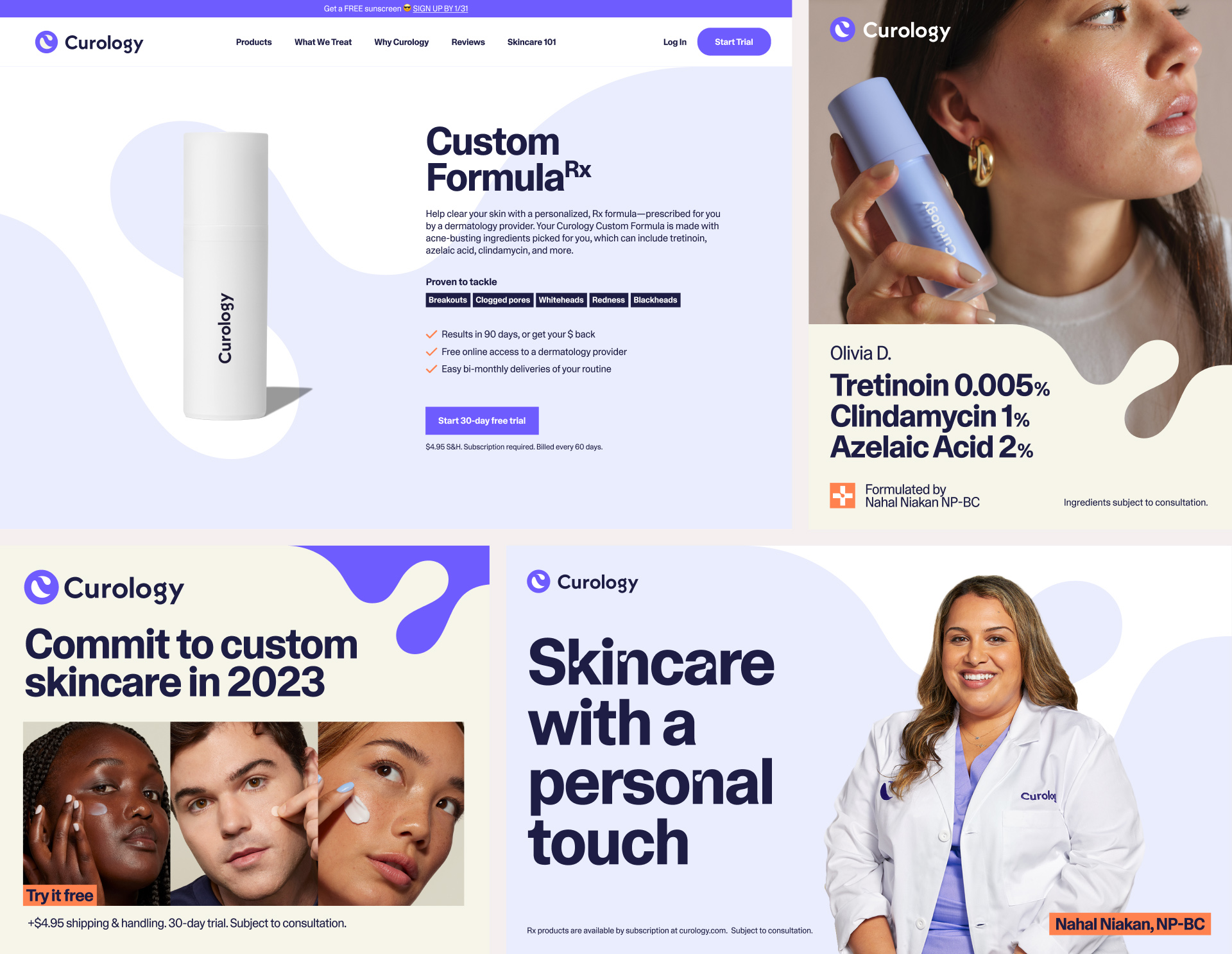
To prepare for our long-awaited nationwide launch at Target stores, Curology needed a fresh, new identity that would define us as a disruptive, innovative player in the ever-so-saturated skincare space.
For the rebrand, we completely revamped our verbal and design identity system, including defining our new colors, typefaces, and design elements.
I took charge of stress testing our new key elements and created key visual assets for our brand guidelines while also leading the development of our new illustration system, which involved art directing freelance creatives.
ROLE
Design
Art Direction
CREDITS
Executive Creative Director: Elaine Fong
Creative Director: Martin Sanchez
Design Director: Malisa Kuch, Christina Chern
Senior Art Director: Nastacia Chubinsky
Creative Lead: Nicole Jahns
Senior Photo Editor: Jade Meneguel
Senior Visual Designer: Diana Mora
Copywriter: Rachel Amoroso
Agency: Gretel
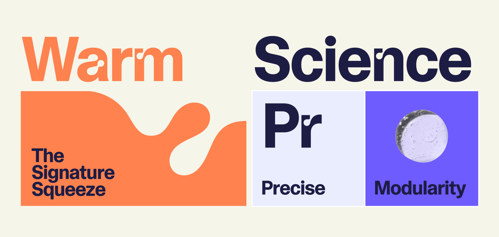
Warm science
We partnered with Gretel early in the rebranding process to define new key elements like color palette, typeface, and the guiding design principle, Warm Science.
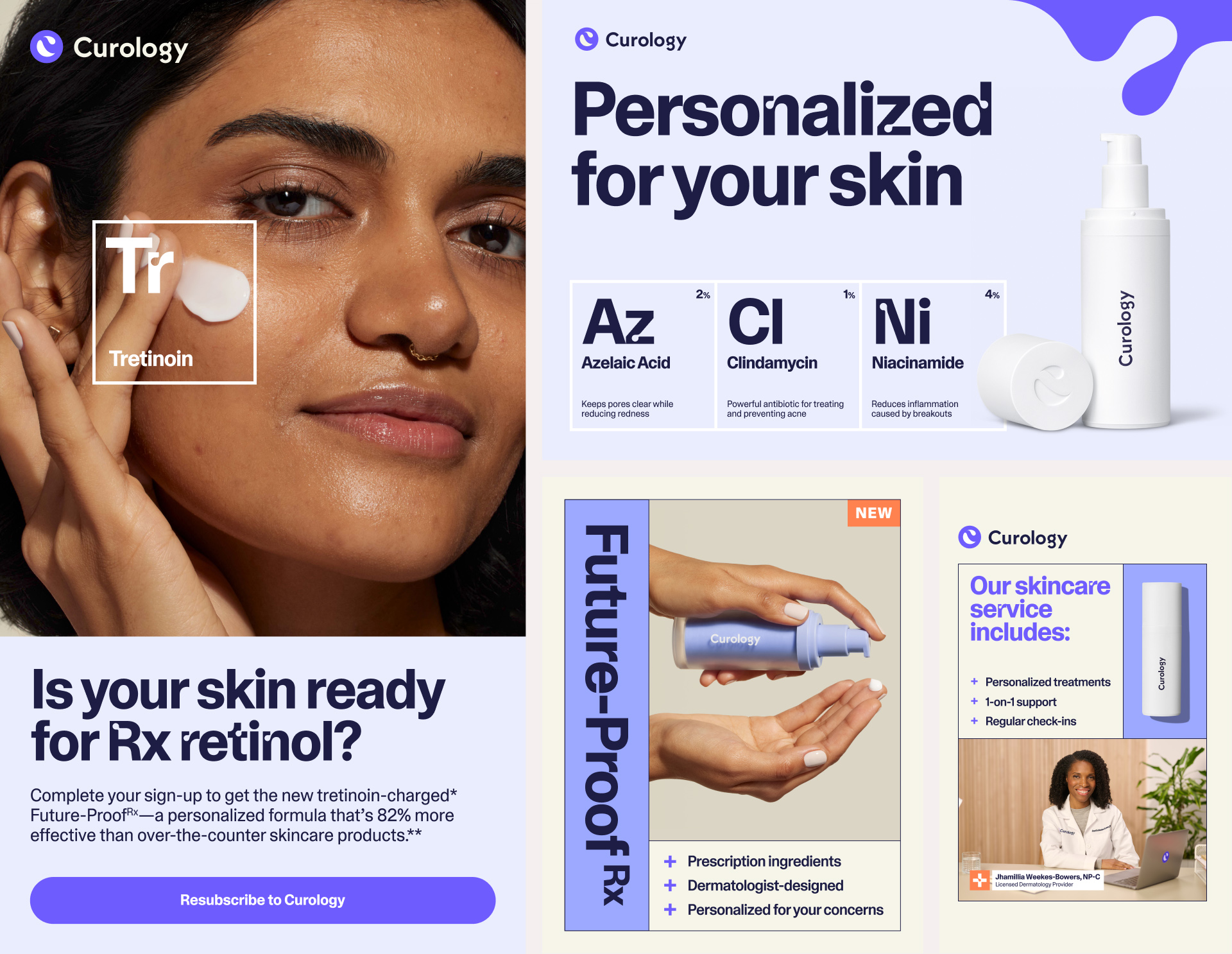
Warm Science is the foundation of the visual identity. Everything designed should feel credible, yet human. This philosophy informs two key design elements: the Signature Squeeze and Precise Modularity.
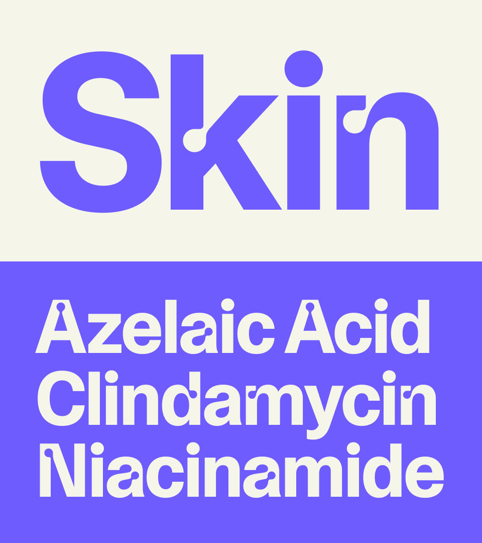
Skintype and the squeeze
Skintype, our custom typeface, is inspired by the pores of our skin and the products we apply to it. The Display version is accented by ink traps that mimic our squeeze, while the Text version is a clean, credible, and versatile sans-serif.
The squeeze is a core graphic component that echoes the inktraps of Skintype and our most recognizable brand symbol, the Curology C. The curves of our squeeze are built from the top half of our C symbol. It can be cropped, mirrored, and scaled to add different points of visual interest.
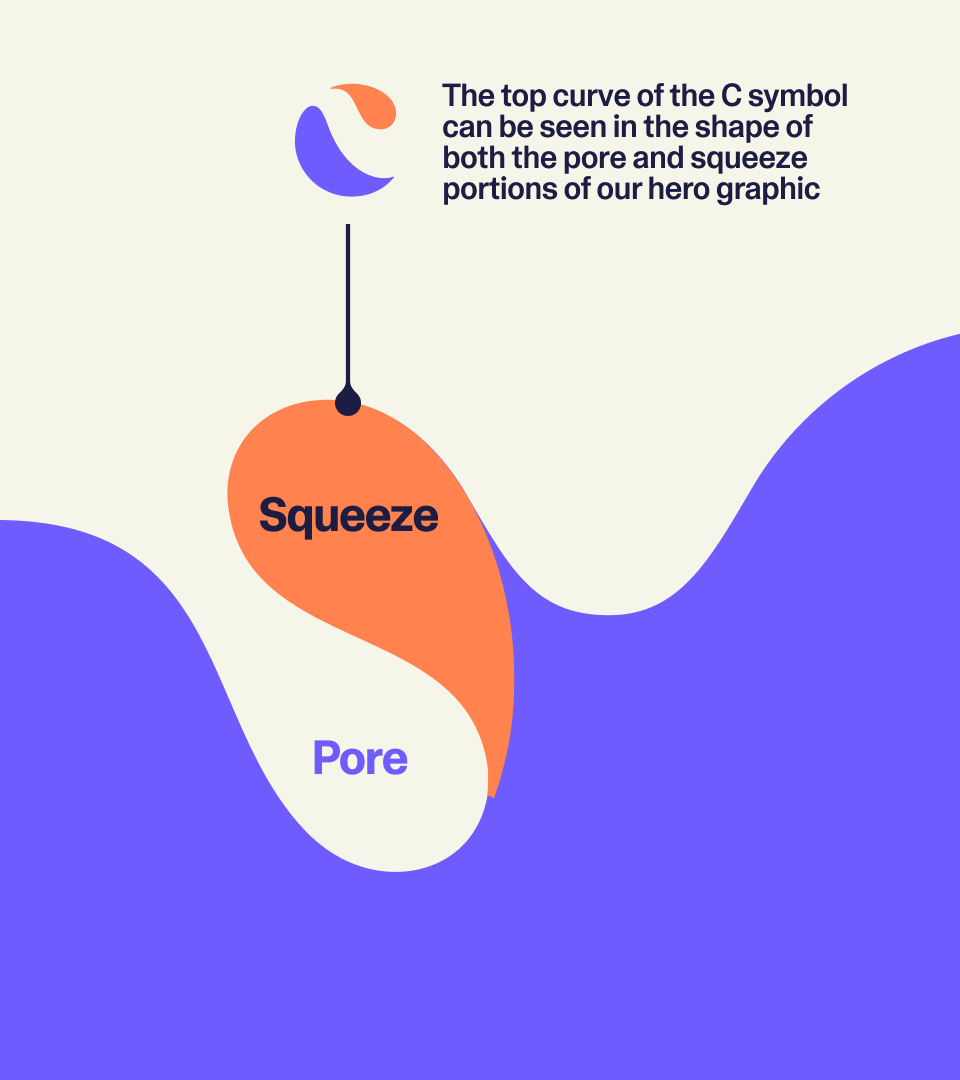

the curve
Comprised of the top half of the C symbol, the curve is a secondary graphic element used to mask certain elements, create an organic frame around compositions, or transition between blocks of information.
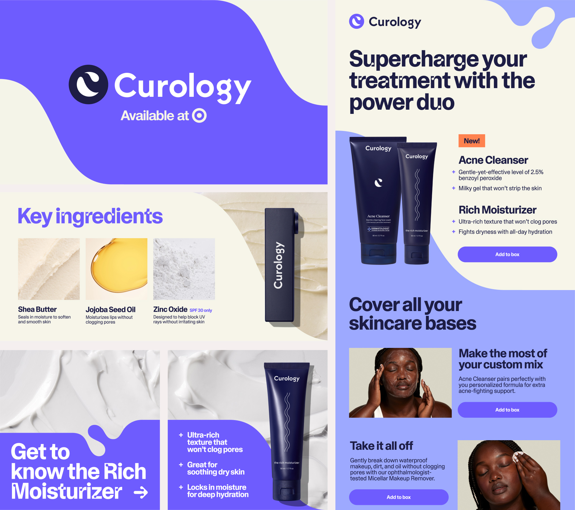
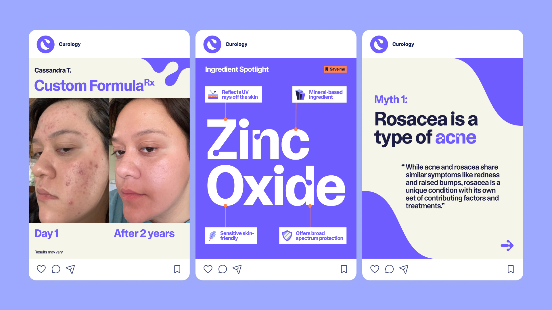
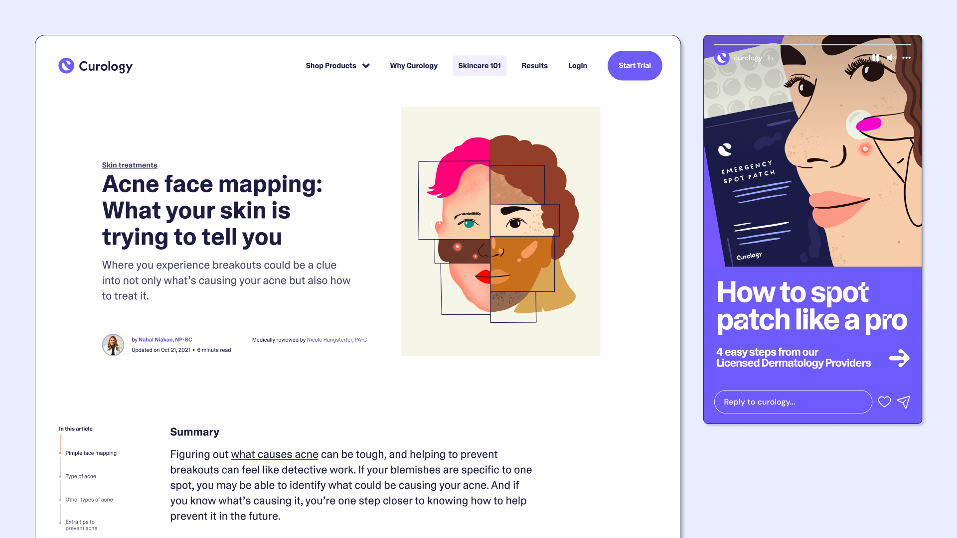
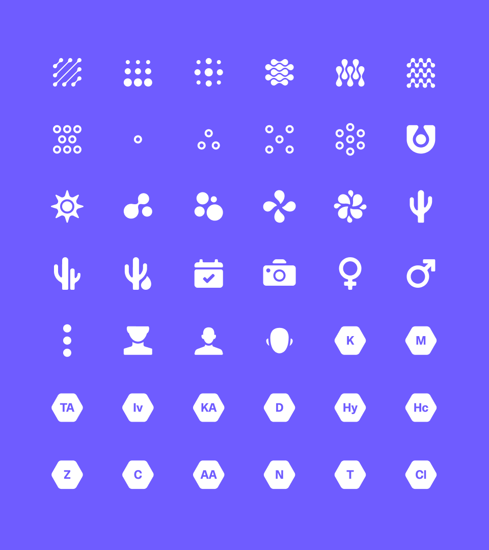
the periodic table
Leaning into the science behind our products, we use a geometric, modular system heavily inspired by the periodic table to organize large blocks of information. These blocks help highlight new products, photography, or even ingredients.

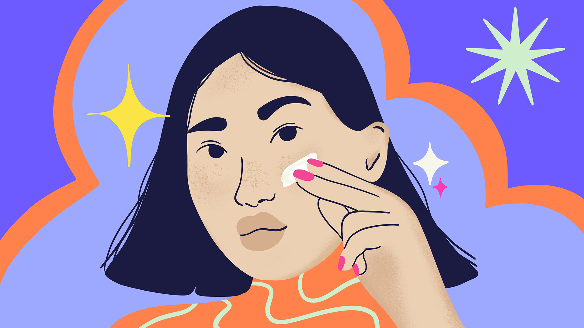
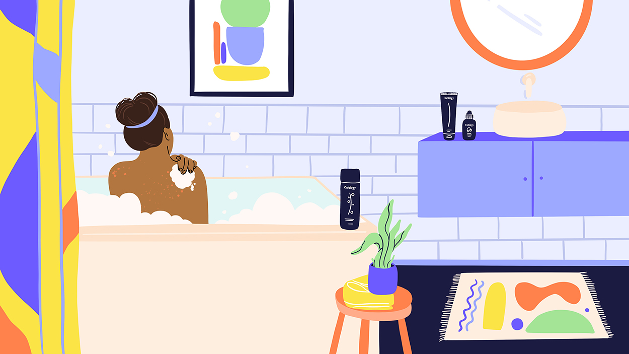
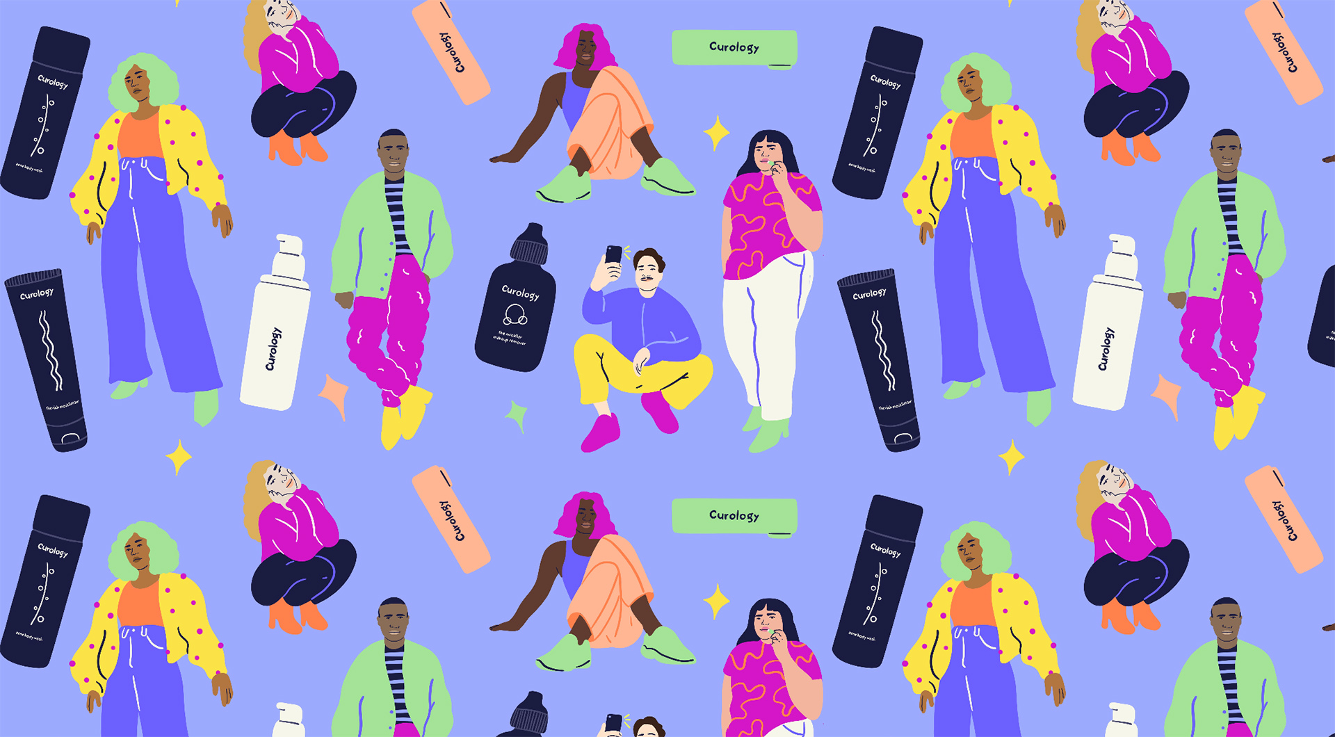
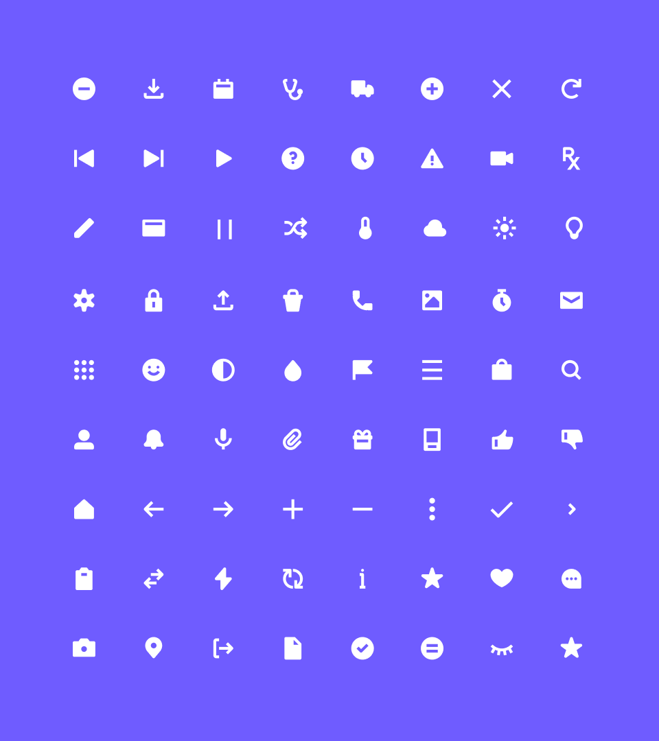
Illustrations and Icons
As part of our rebrand, we needed to redefine our guidelines for illustration and iconography. I took charge of finding an illustrator and icon designer and worked with them directly to create and define our new illustration style and icon design system.
CREDITS
Illustrator: Sol Cotti
Icon Designer: Jordon Cheung